My Process
Project snapshot:
how did I go about solving responsive behaviour issues?
1. Research
Through a combination of qual interviews and analytics I’ve found out what screen sizes users favour.

2. Co-creation
I then facilitated a brainstorming session with Tesco designers to detect common patterns across the different applications of the enterprise suite.

3. Refinement
I then experimented with translating components across different screen sizes, de-bunking the assumption that the design is mostly needed for big screen.

4. Delivery
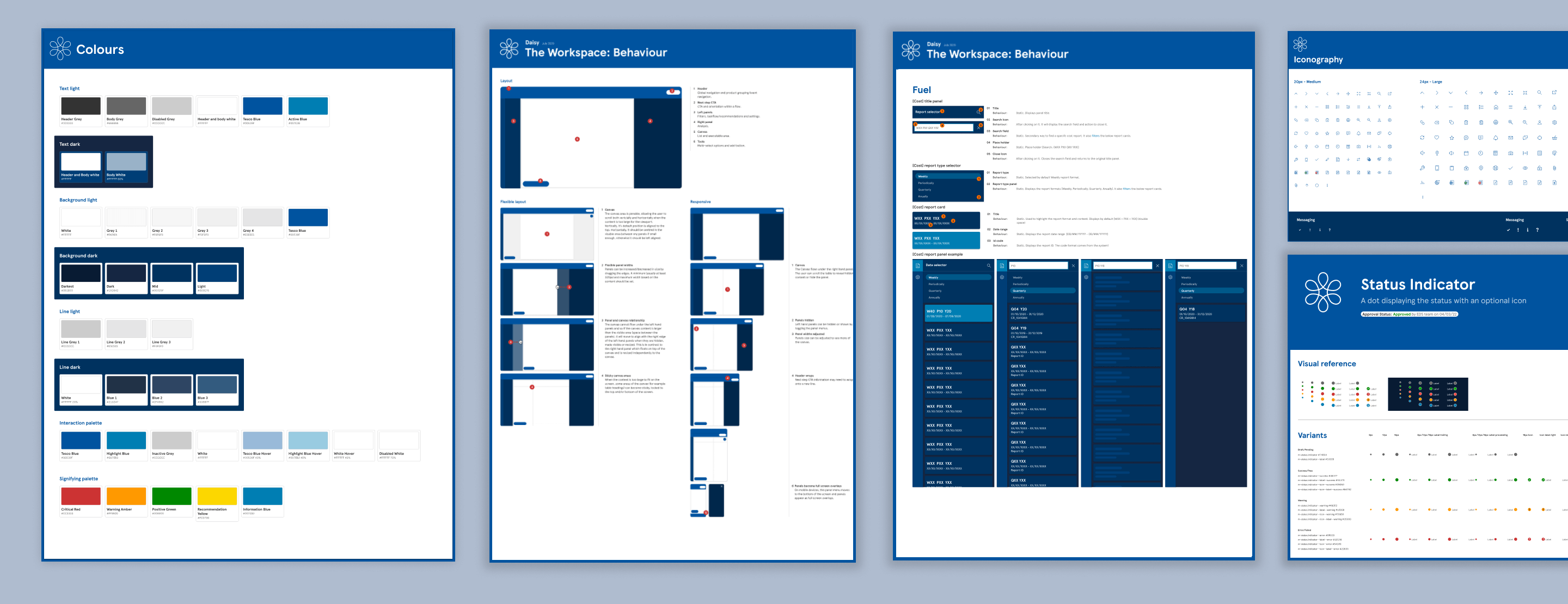
Following that, I’ve created various documentation and soft guidelines to follow.

Impact of my work
Business got:
Design system (Daisy) increased in maturity and gained focus on real user needs. Reduction of pattern waste meant dractic reduction of time and resource needed to design applications.
I learned:
The intricate art of team alignment when in different timezones and working cultures.


