CorResilience Back Office

All the different steps gathered in a single platform.

The CorResilience Back-Office (BO) was built to facilitate the management of all the administrative tasks behind the CorResilience app. This system allowed the administrators to search, organise and view all the data of the CorResilience app users, as well as, easily process the requested actions requested through the app.

Company

CorResilience

Project Duration

1 Week

Team Members

Andres Arigon - UX/UI Designer, Anna Winterbottom - Product Owner

Problem

The CorResilience Back-Office was launched in MVP state to serve the administrators who were, up until that point, managing the registered users and doctors using excel spreadsheets and email/phone. To this end, I had to design a platform in order to address this inconvenience quickly.

The number of CorResilience users kept growing until reaching a point where this initial BO version stopped being effective and efficient for daily management. This MVP version lacked essential functionalities. For example, a history tracking system to allow administrators to be aware if someone else has been working previously with the same user.

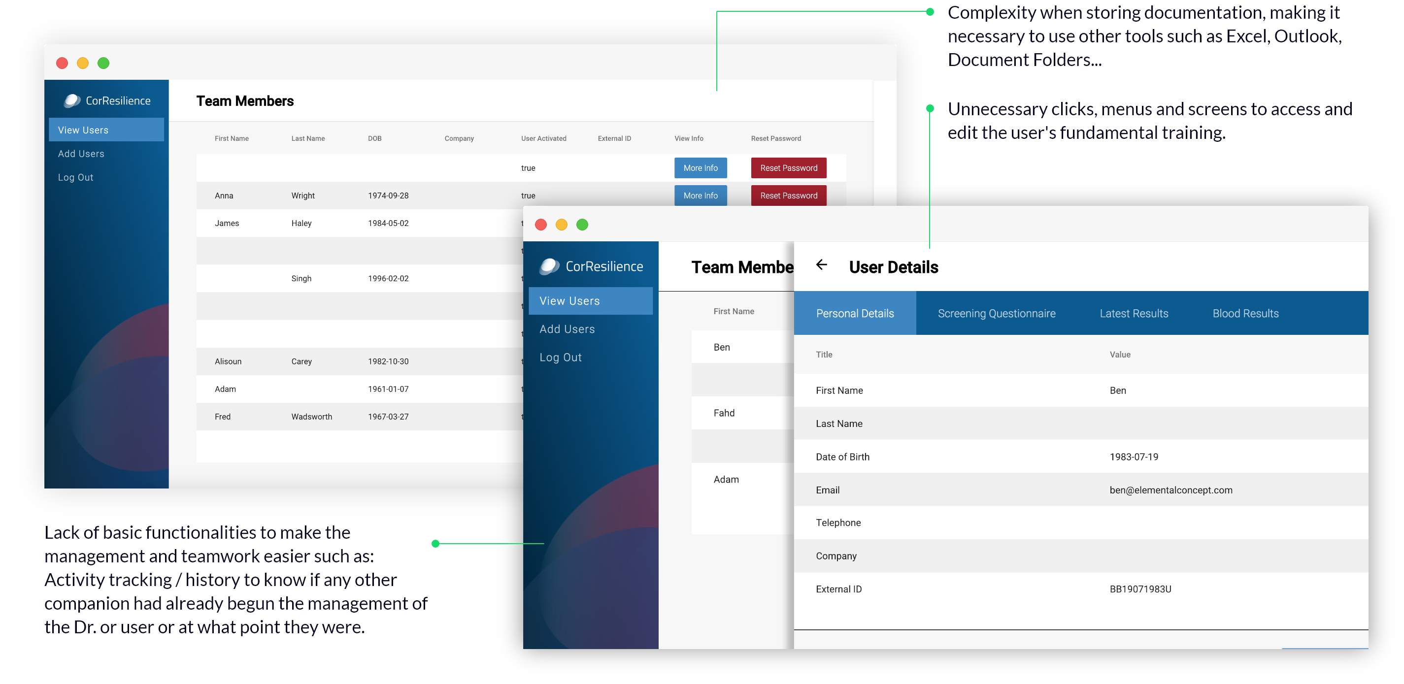
Apart of functionality problems, this first BO version had usability problems, from too many click throughs, pop-ups and windows sliders. This made easy tasks tedious and complex due to the journey that the administrator had to do. In addition, there are a lack of visual aids, branding and definitely, a lack of design appeal.

Goals

Project Target

  • Reducing time spent on tasks and generally increase the efficiency of the BO
  • Making the new BO user-friendly
  • Reducing the amount of extra administrative management outside of the BO

Design Target

  • Reducing the user-flow and the interface complexity
  • Improving the architecture and hierarchy of information
  • Creating a technical guideline useful for current and future design and development
  • Designing having to use a framework in mind
  • Increasing the presence of CorResiliance branding in the Back-Office.

Challenge

I was assigned to this project a year into build, replacing the original UX designer who moved on to another role. Being responsible for temporarily covering their absence was a big challenge as I had to understand this project quickly.

I had a responsibility to improve the current UX, add new and essential functionalities to facilitate the administrators tasks, as well as reduce the current complexity of the user flows in less than one week. As it turned out, I could not move away from the initial MVP version because the users were already used to use it, even with its UX/UI problems, which left me in the position of building over the current MVP design which was a real challenge.

On top, I wanted to consolidate the CorResilence re-brand, to help both for the users and the developers in charge of coding the project.

My Process

The first thing I did when I landed on this project was an E2E test of the original BO as a completely new user, to gauge first impressions without external feedback. I wrote my first observations down, which later I used to compare with the users’ feedback reports. There were clear consensus between my impressions and the users’ conclusions.

I completed a full UX Audit in order to deeply analyse the journeys section by section, taking notes that I organised in three topics: User Experience, User Interface, Functionality. Once my report was finished and presented with other conclusions in mind, I proposed to the product owner the first critical decision: To re-design the user flow in order to reduce the complexity.

After re-designing the user flow, the next step was to research clean and modern UIs, that I compiled in mood boards. These were very useful to inspire and help me to start thinking how the new BO UI could look.

With some ideas in my head, I started drawing my first sketches designs on paper and from there, I jumped to work on the High-Fidelity mock-ups using Adobe XD. Once the high fidelity designs were approved by my team, I started thinking about the basic BO micro- interactions and at the same time, I started creating a quick guideline in order to both improve the CorResilience UI style guide and make the current and future development easier.

I decided to pause my process and establish at least one person to help me better evaluate the current and new BO proposal. I always try to design the best experience, not for me, but for the real users who will use this platform every day as a tool to make their lives easier.

Persona

Although I didn't have much time, I decided to pause my process and establish at least one person to help me better evaluate the current and new Back Office proposal. Trying to design the best experience, not for me, but for the real users who will use this platform every day as another tool to make their tasks easier.

Jessica Smart, 28 years old, London
Office Manager

  • Responsible for the management of records of new Drs and users, such as document management, appointments, registrations and cancellations.
  • Small team manager.
  • Currently managing all COR tasks using Excel Spreadsheet, Telephone and the current version of COR Back-Office.
  • She prefers visual elements and photos of previous work related by the company, followed by opinions. by the company followed by opinions.
  • She currently doesn’t have easy or short days.
  • She doesn't like new changes.
  • She is pro-active and will generally prefer to find solutions and avoid asking for help.

User Quotes

I examined the actual users’ feedback from emails and chats that came to the Product Owner. I also had the luck to chat with some of them face-to-face so I could extract the following quotes which were crucial for the new design.

"I would like to carry out my admin tasks without having to use external contact resources such as the phone or email"

"My Outlook inbox is always full with users emails asking for different actions which ones are not possible to process them through the platform. It is very hard to maintain order in the process"

"I would like the BO to be more accessible for new personal stuff"

"It usually takes me a considerable amount of time to move through the platform from X to Y"

"I would like to be available to see the reports in the BO without having to export the data to Excel and create it by myself"

UX Audit

The UX Audit was an essential part of the process. The conclusions were very useful to start the brainstorm of possible solutions, new layout of the architecture, content hierarchy and so on. In addition, this audit was helpful to pre-validate some ideas that I had in my head and saved hours of work in something that likely was not going to work. Some of these points were...
Visual Research

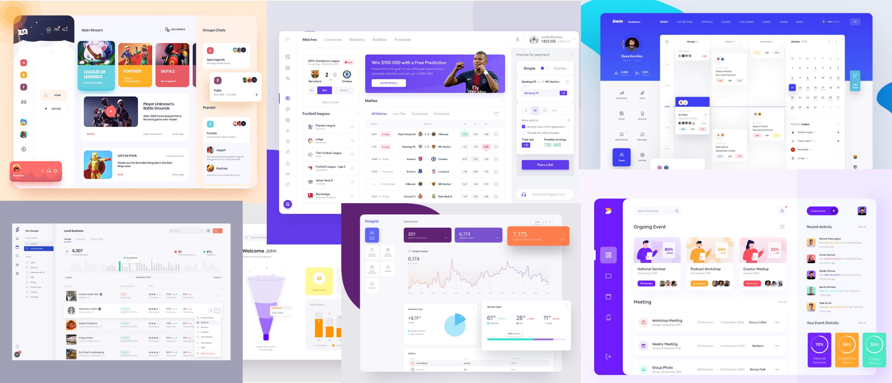
Looking for ideas online to improve the interface, the user experience and solve the functionality problems, I saved some ideas in a mood board. I do this for every project - Having this by my side to use as a reference is very helpful when I feel stuck in my design process.

Mood Board: Dashboard/CRM

Some reference images that I use both to design the new UI as well as the new User Flow.

User Flow

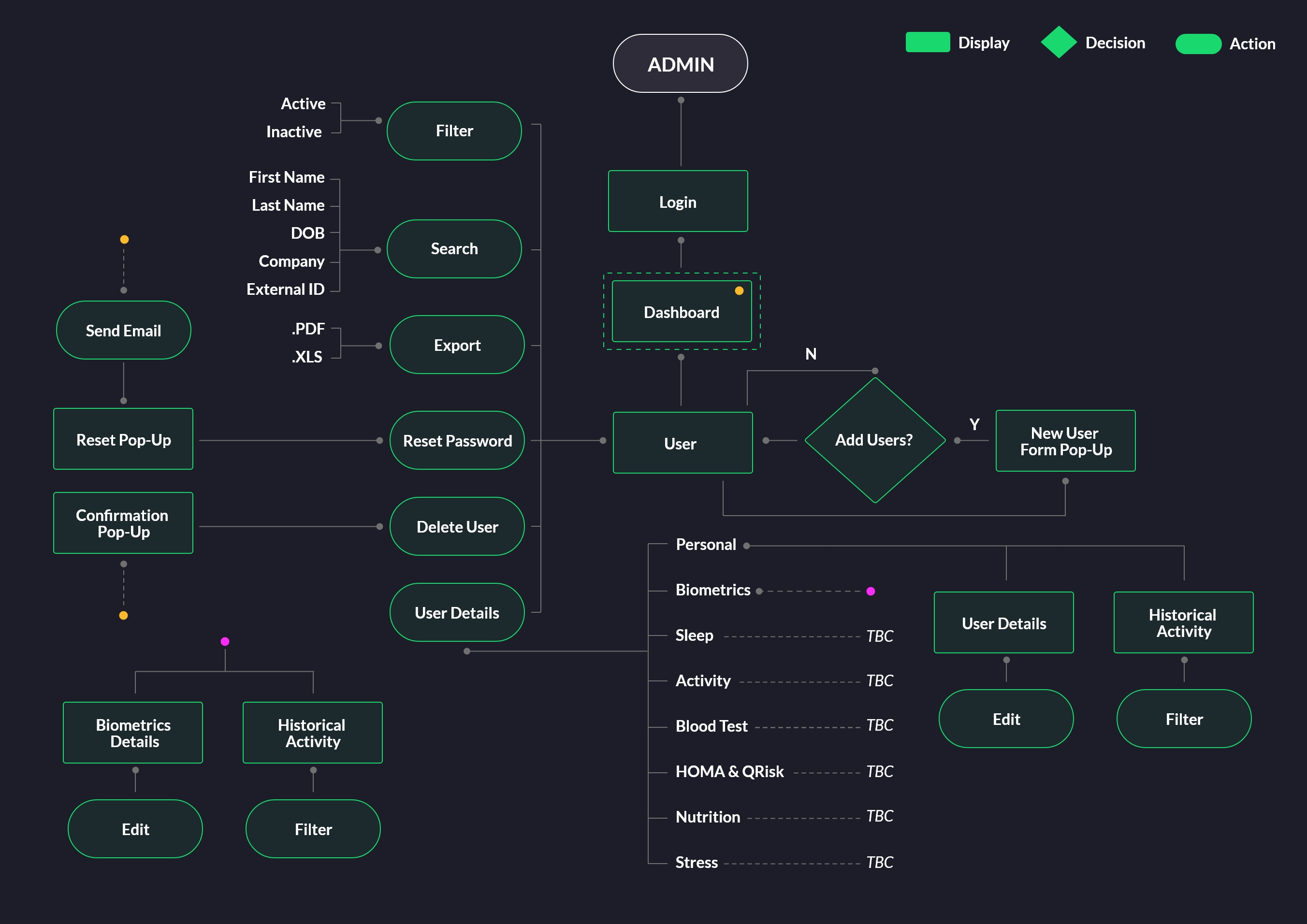
After analysing the feedback and my notes, I started working on a new user flow to make the journey easier for the users, allowing them to save time when performing their tasks avoiding unnecessary actions and adding essential functionality.

User Flow: Edit User Journey

It was the first and more important for the admins that I re-design. “As an Admin, I would like to edit the users details and check their Biometrics"

Sketches

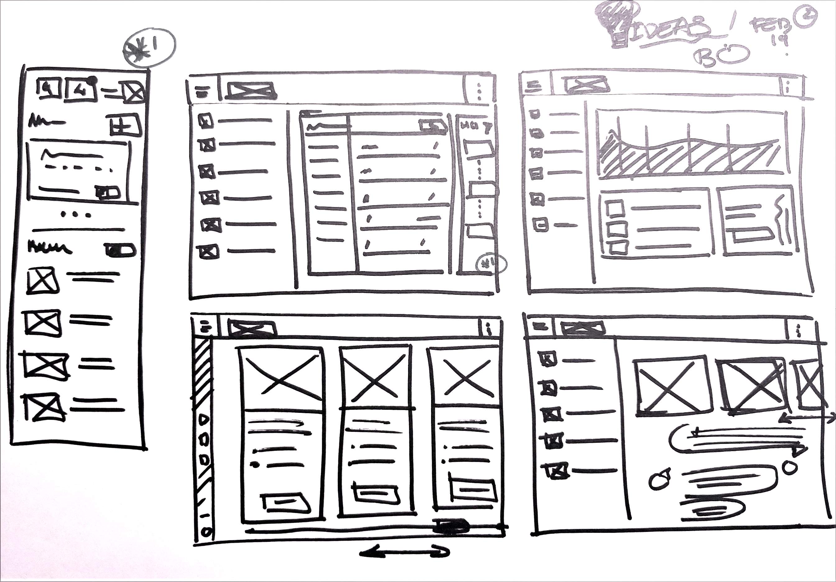
Using the new user flow, my references and the original BO design, I made sketches to start visualising my first ideas before spending time on high fidelity mock-ups.

Quick Drawings

My first thoughts on paper.

High Fidelity Mock-Ups

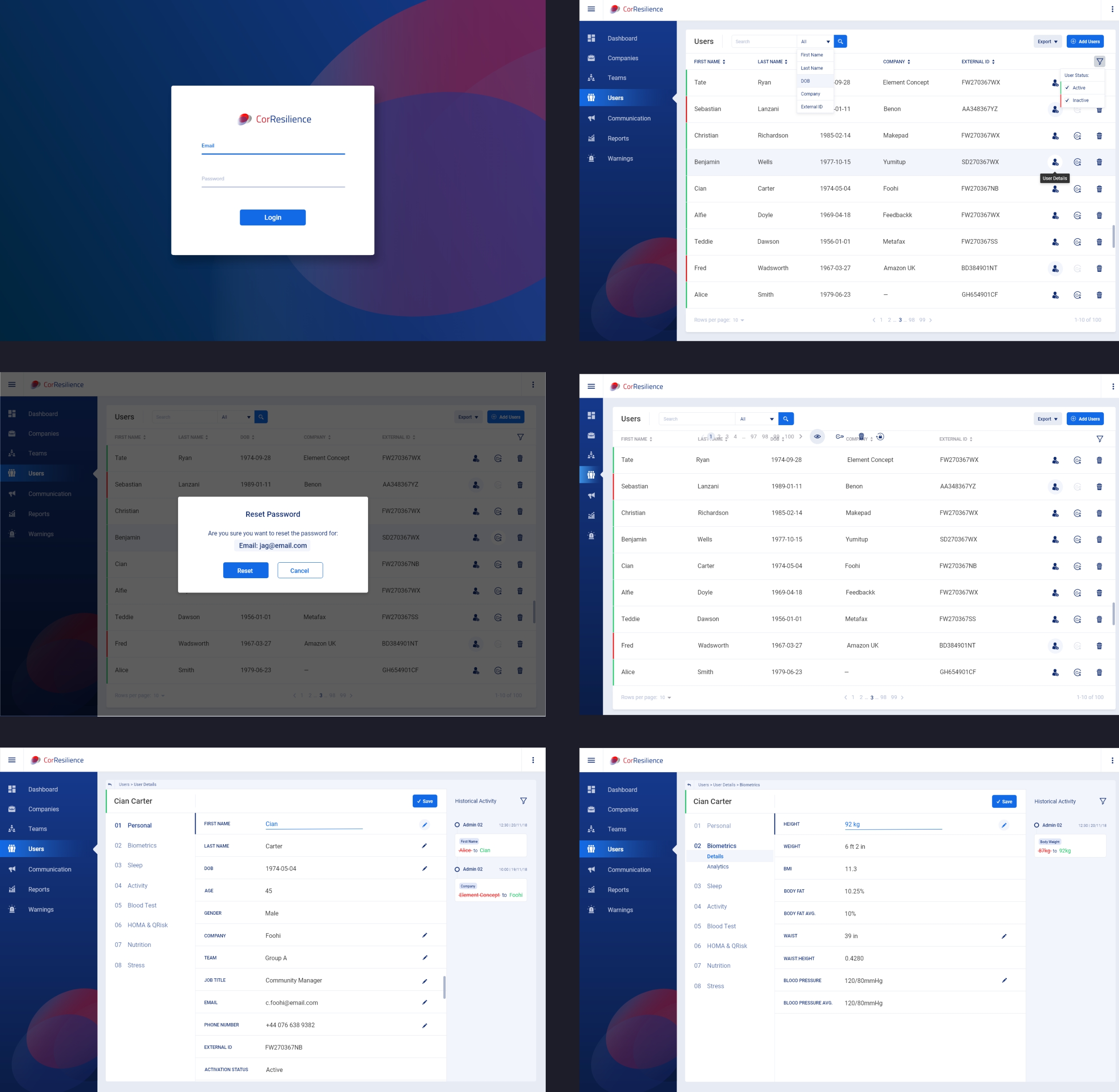
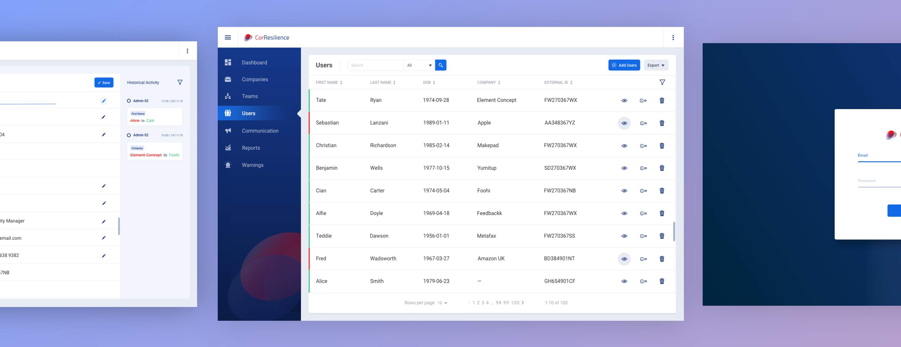
Having mocked up a few ideas, I presented them to the product owner to get their blessing. She liked my first idea so then I quickly started working on the High-fidelity mock-ups using Adobe XD.

As you can see, my UX/UI solution modernises the interface and reduces the complexity of the system as well as the management time required by the CorResilience team. Re-planning the user flow, eliminating unnecessary parts of the journey, like pop-ups, clicks and slider windows made the user-flow easier and intuitive to follow, even for someone who had just started using the system. Incorporating the new and essential functionalities was key to improving BO efficiency. Finally, another important key point I suggested was to add aids, references and visual elements to make the interface easier to read and understand - I did this by adding helpful tags, increasing the padding between elements, improving the information presentation and improving the content hierarchy.

Guideline

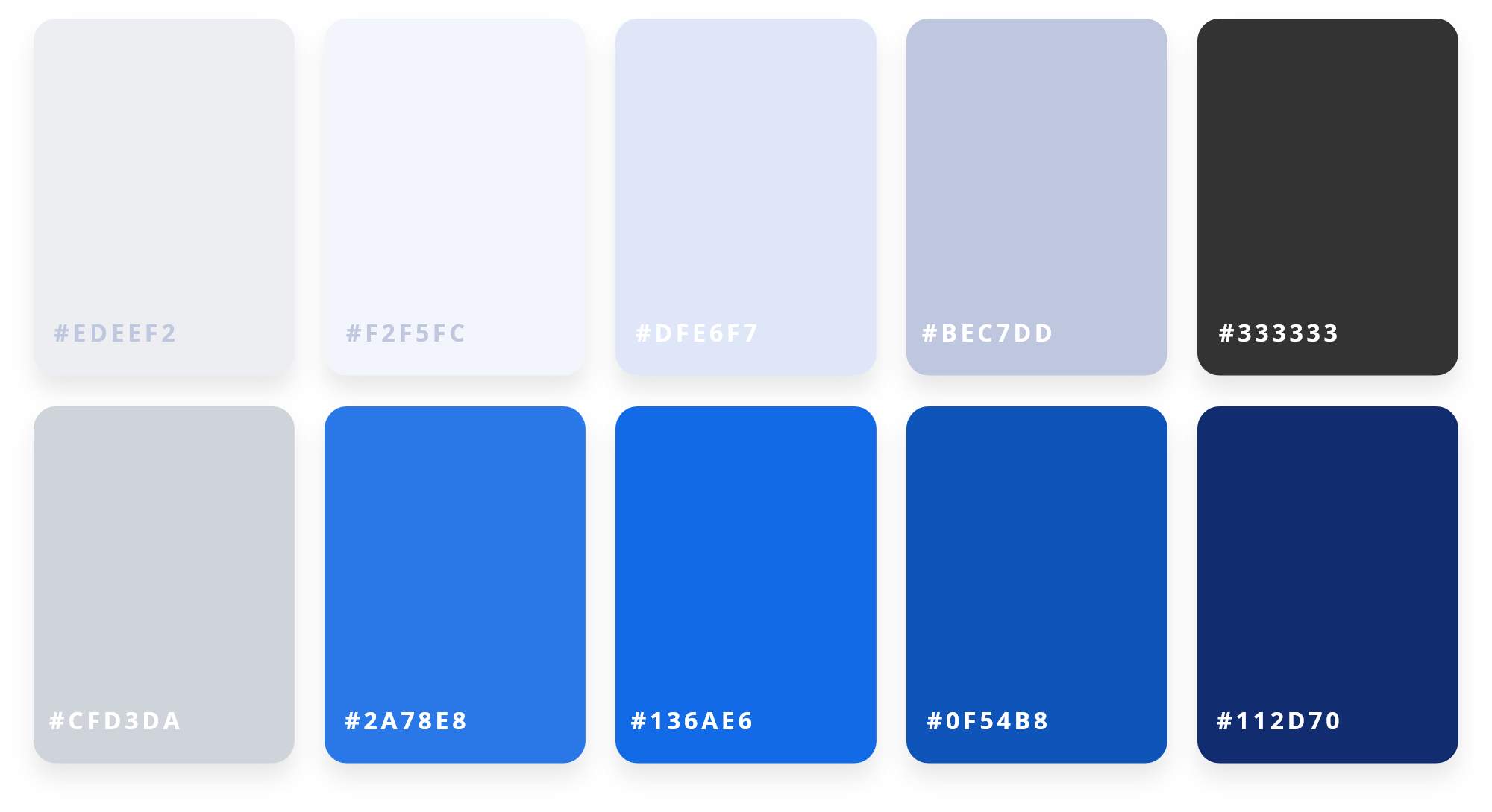
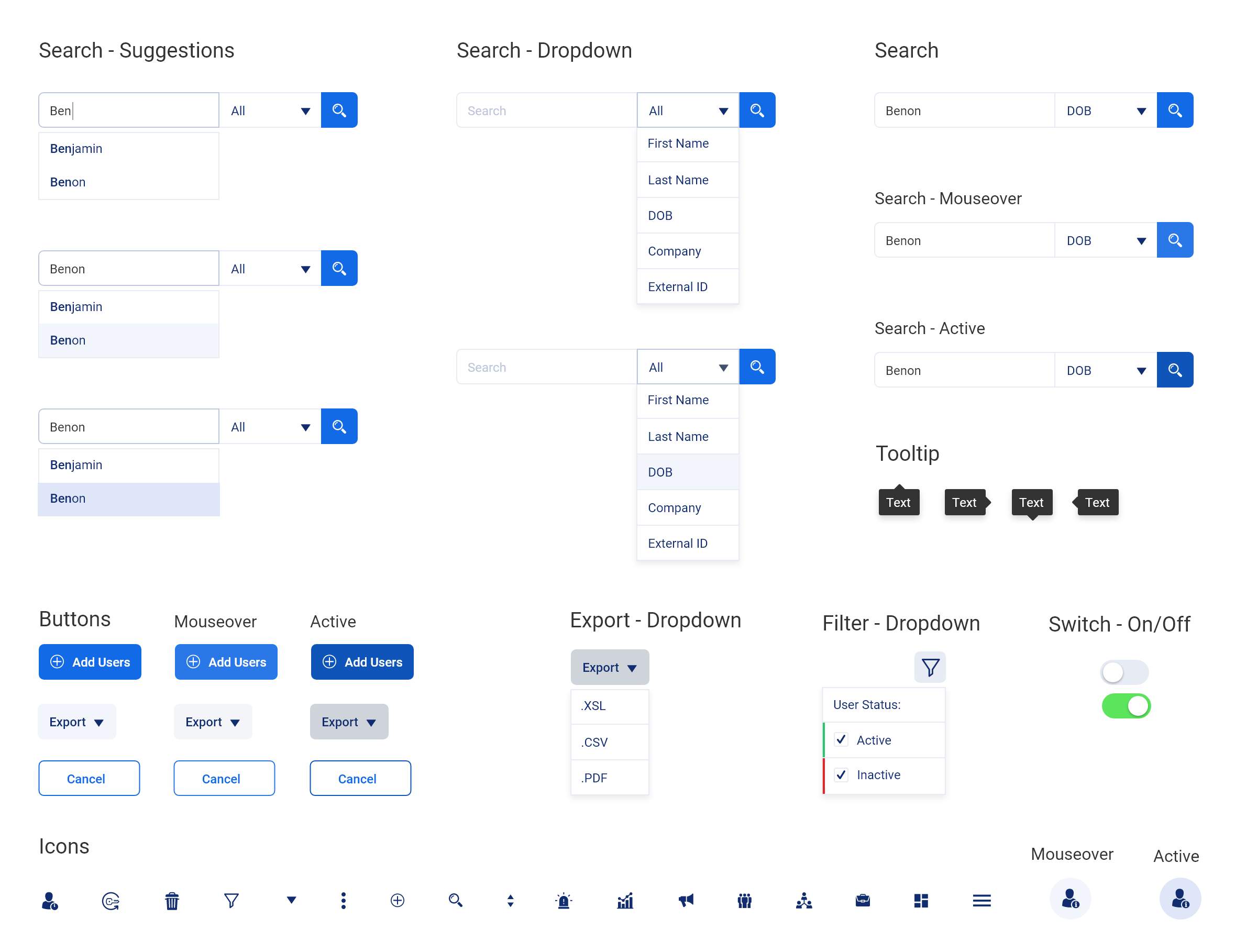
Another important task in this project was to improve the Corresiliance branding presence. I have updated the color palette and updated all the web elements such as form elements, buttons, micro-injections, etc. Also, I have created a guideline designed to facilitate the developers tasks having this document as reference with all the UI details and also for future interactions.

Colour Palette

Main palette used throughout CorResilience

Micro-Interactions

Some of the most relevant interactions across the Back Office

Final Thoughts

From the start, this project had a clear objective: Improve the user experience of the current users who work with the CorResilience BO every day.

Once my changes were implemented, we saw a big change in users’ attitudes working with the new Back Office. The frustration generated by the previous BO had been addressed and task efficiency had significantly increased.

This project was a challenge. Since I did not have a lot of resources, time and support, I had to adapt the little resources I had and turn around a strong design that cut to the core of the users issues. I feel we were very successful in what we accomplished.

Let’s do something amazing

Feel free to get in touch with me

Contact Me