CorResilience App

A dynamic, new personal resilience application.

CorResilience (COR) is a powerful application that was created to enable workforces to achieve profound and sustainable changes in their lifestyle habits, while actively reducing long-term risk of disease.

Company

CorResilience

Project Duration

1 Month

Team Members

Andres Arigon - UX/UI Designer, Anna Winterbottom - Product Owner

Problem

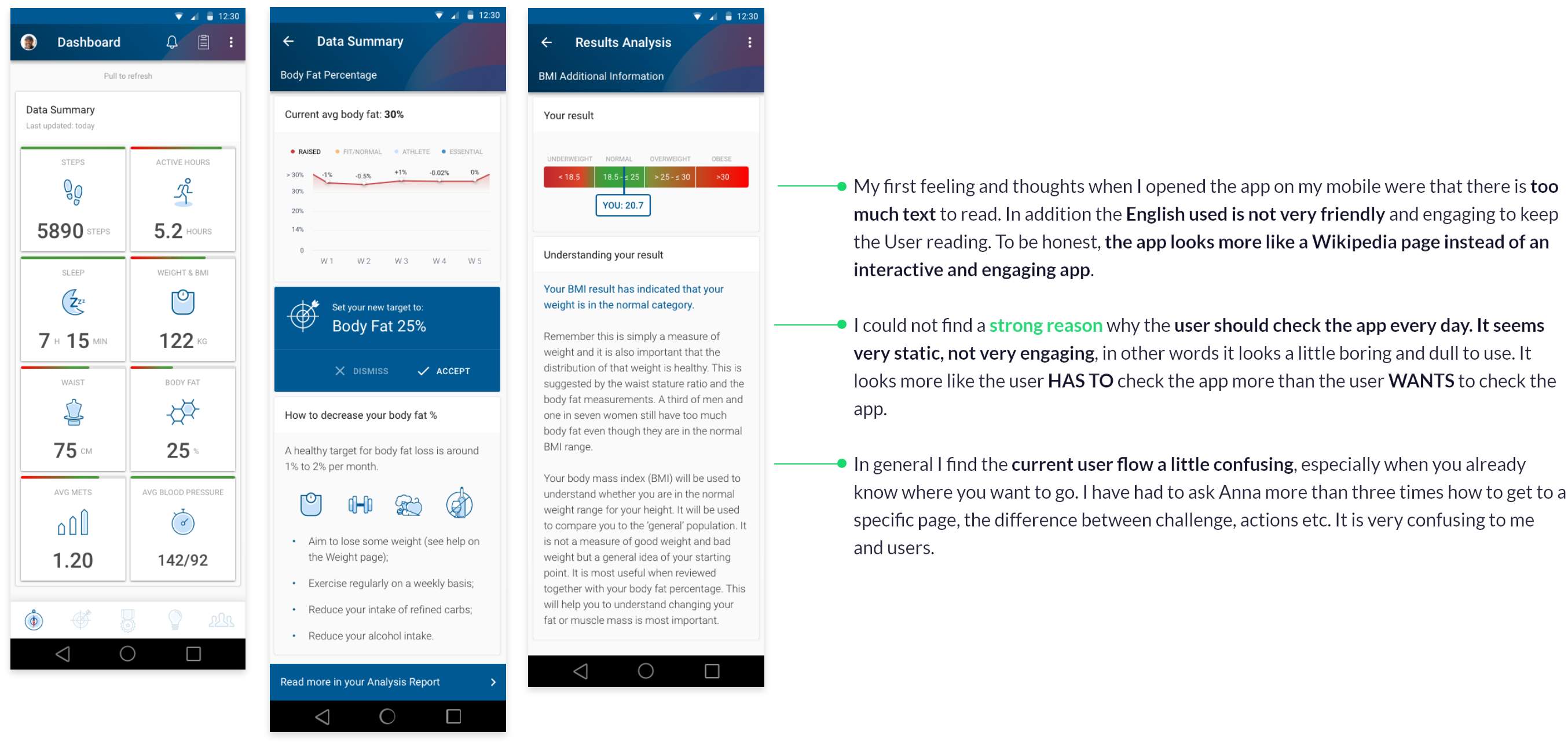
The CorResilience MVP was officially launched in September 2018. As it was rolled out, user testing helped us to find issues in the user experience to focus on for the next rollout. One of the main problems was the low rate of interaction after a certain point of use, a lack of dialogue between the user and the app. The general experience to the users was over complicated at times, lacking in visual aids and was very text heavy. The core issue however was the lack of drive for the user to check it every day - This stickiness became our focus and key objective.

Goals

Project Target

  • Sell the app license to 3rd party
  • Increase the users base 150%
  • Convert the app into part of the users’ daily routine
  • Make the app a main reference point to check the users’ health status

Design Target

  • Make it more visually appealing and interactive
  • Improve the user engagement
  • Reduce the user journeys complexity and frustrations
  • Simplify the user interface and content
  • Generate a new idea of improvement and get the clients green light.

Challenge

I had been asked to propose completely new and fresh ideas for the COR app, with a month’s turnaround time to present to the client. I had two big challenges: One, improve the user interface and user experience to boost user engagement. Second, present the new ideas to the client and get the green light to start developing the revamp.

My Process

My design process was limited, as I was working across multiple projects at this time. In addition, the COR team needed to have a new proposal ready to show to a client in less than a month. Therefore, all the UI design you see here are sketches or low-fidelity, as their only goal was to make the new ideas easy to understand.

The first step in my process was understanding where the problems in the current app were and the objectives that COR wanted to achieve. I made both quantitative and qualitative reports following Google Analytics reports and users’ feedback from email forms. I also did a deep UX Audit of the current app version. Subsequently, with all the information and conclusions collected, I created sketches and low-fidelity mock-ups which I assembled in a presentation to the clients.

User Testing Feedback (Email Forms)

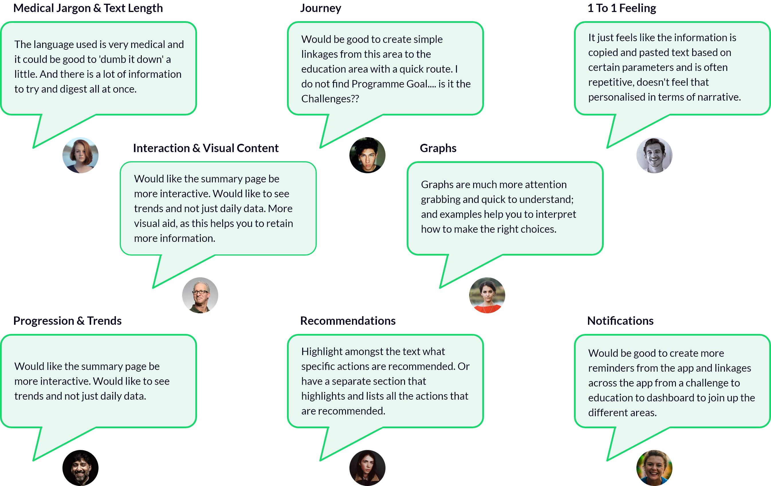
After reading all the feedback from real users carried out in December 2018, I observed a reiteration of "pain points" with the current app status. I kept these in consideration for the re-vamp proposal.

Google Analytics Report

On top of feedback, the analyst in me always wants to analyse quantitative data to highlight all the new information that the qualitative data may not show.

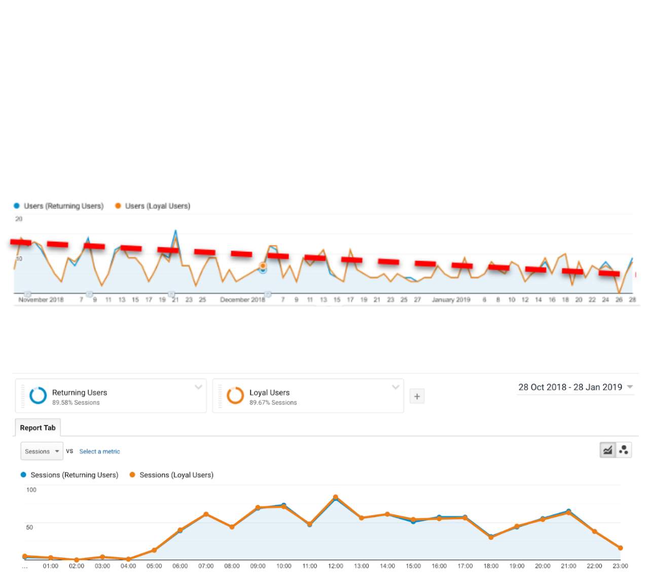
Analysing some statistics and graphs in Google Analytics allowed me to draw some fundamental conclusions for the redesign of the main user flows, behaviours, trends and problems. For example, I observed users spending more time on the app during the morning, on their way to work, than during the rest of the day.

Main Ratios

New users vs Return Users vs Loyal Users vs All the Users.

1 Jan 2019 - 31 Jan 2019 vs 1 Dec 2018 - 31 Dec 2018

Aim: Try to build a larger base of loyal users (engaging with the app more than 3 times a month).

hourly traffic (Oct18 - Jan19)

The top three time ranges where users check the app are: Early morning (On their way to work); Lunch time (Lunch break) & Evening (After dinner time).

Day of the week traffic (Oct18 - Jan19)

0 = Sunday 2 = Tuesday 4 = Thursday 6 = Saturday 1 = Monday 3 = Wednesday 5 = Friday

There is not constant use during the week (M-F)

We should consider making something to make this app more appealing to use during the weekend. Make it look more fun than a work app.

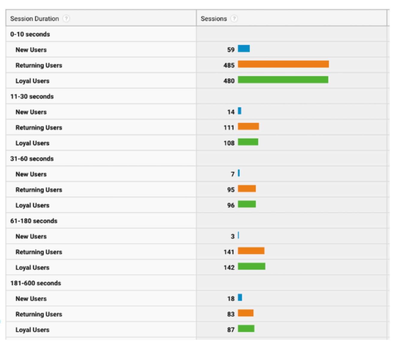
Two groups of users

Users who spend less than 10sec/month on the app.

User who spend between 1 -2 minute/month on the app.

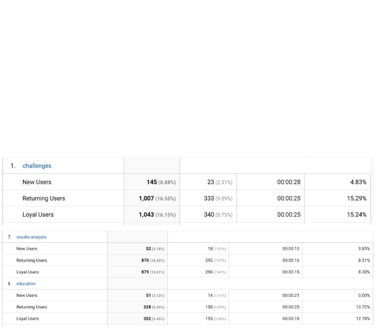
The 3 most popular pages (Oct18 - Jan19)

Check and go. Users do not spend a lot of time on the page.

UX Audit

After using the app, I was able to understand many of the users frustrations. I made a list of features that I found crucial to take into accountto improve the user experience. Some of these points were…

UX Conclusions

After having analysed all the reports and spent time exploring the app as a user, I was able to make some conclusions which were crucial for the client presentation and my new proposal.

  • The app has long sections of text which the users are not reading. They want to open the app, scan and go. Better to have an overall summary text with the option to read more.
  • The English used should be more plain and easy to understand. Sometimes, you need to read the text more than once to understand what it says. A more friendly text tone and personalised approach would help to engage the users.
  • We should make the journey more simple and connected between each section. A lot of users feels confused trying to find specific points on the app.
  • We should consider bringing all access points to the dashboard to have a consolidated home screen to reduce the user frustrations.
  • Have more visuals and less text. This will make the app look more lively and friendly. It will also help the user to gauge their health in a glance.
  • Build a personalised relationship between the app and the user. Make it feel unique for each user, not copy/paste content.
  • Make it more interactive and less like wikipedia.
  • Help the users at all times. For example, give them recommendations on how to improve their health and keep them engaged with a good notification system.

Visual Research

The first thing I did to get a better gauge of this market and UI trends was to surf the internet and gather different apps with similar topics to get a bit of visual inspiration.

Mood Board: Health/Fitness app

These are some of the images I use as a reference.

Sketches

These are some quick sketches that I was drawing while I was doing the UX research. As a teacher once taught me, you never know when a good idea will come; always better to write down before it disappears.
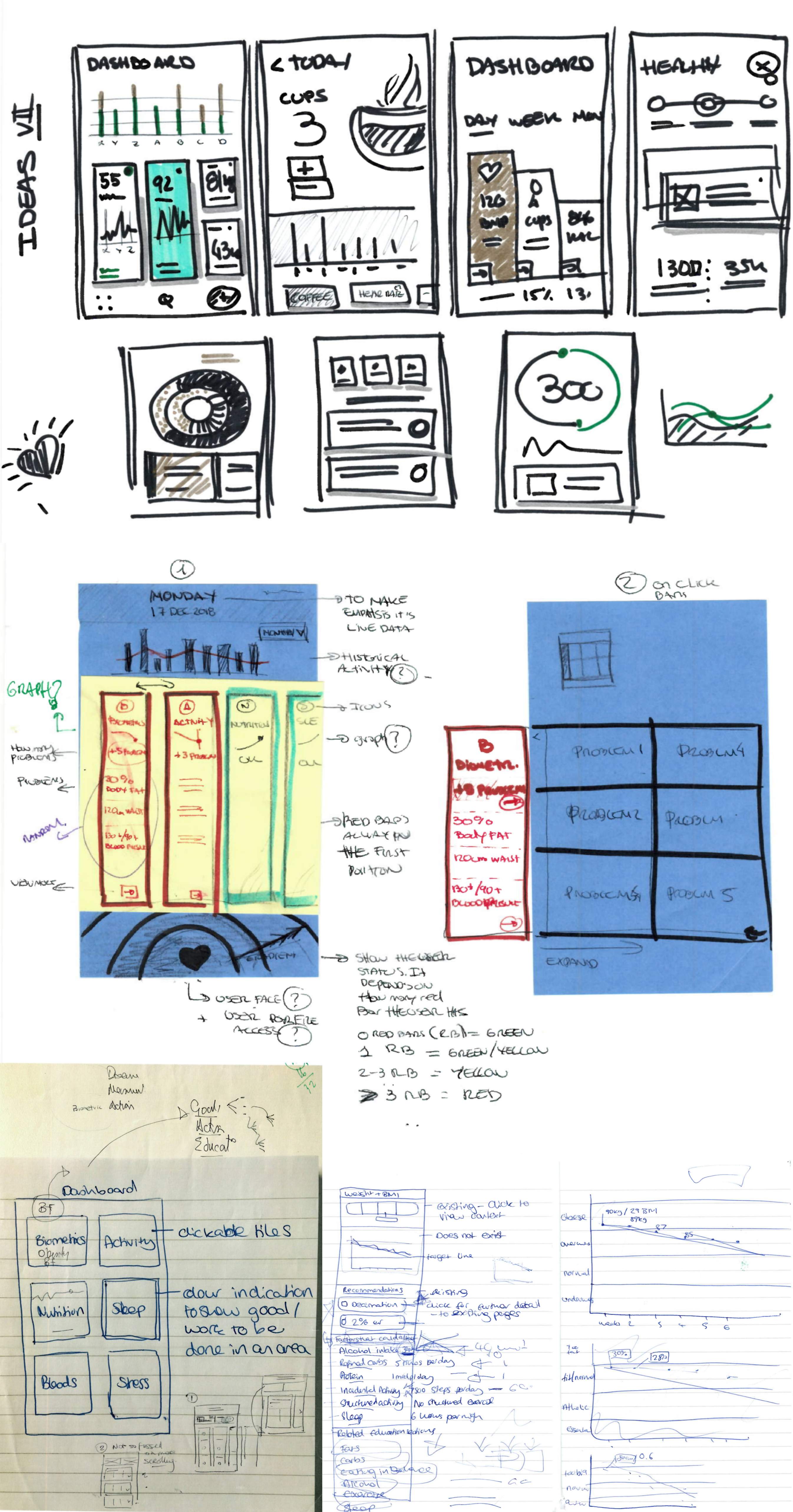
Pen and paper ideas

Sketches with different ideas about the new COR app.

Workshop Session

After some brainstorming, I arranged a workshop with the COR Product Owner, Anna, to work together to develop the "final" idea. I put together my first concepts with her ideas and objectives and we worked in tandem, exchanging different points of view and potential approaches.

After an intense 2 hours workshop, we arrived at a solid idea for the new design.

Our two hours of hard work and discussions

Sketches with different ideas about the new COR app.

Low-Fidelity Mock-Ups

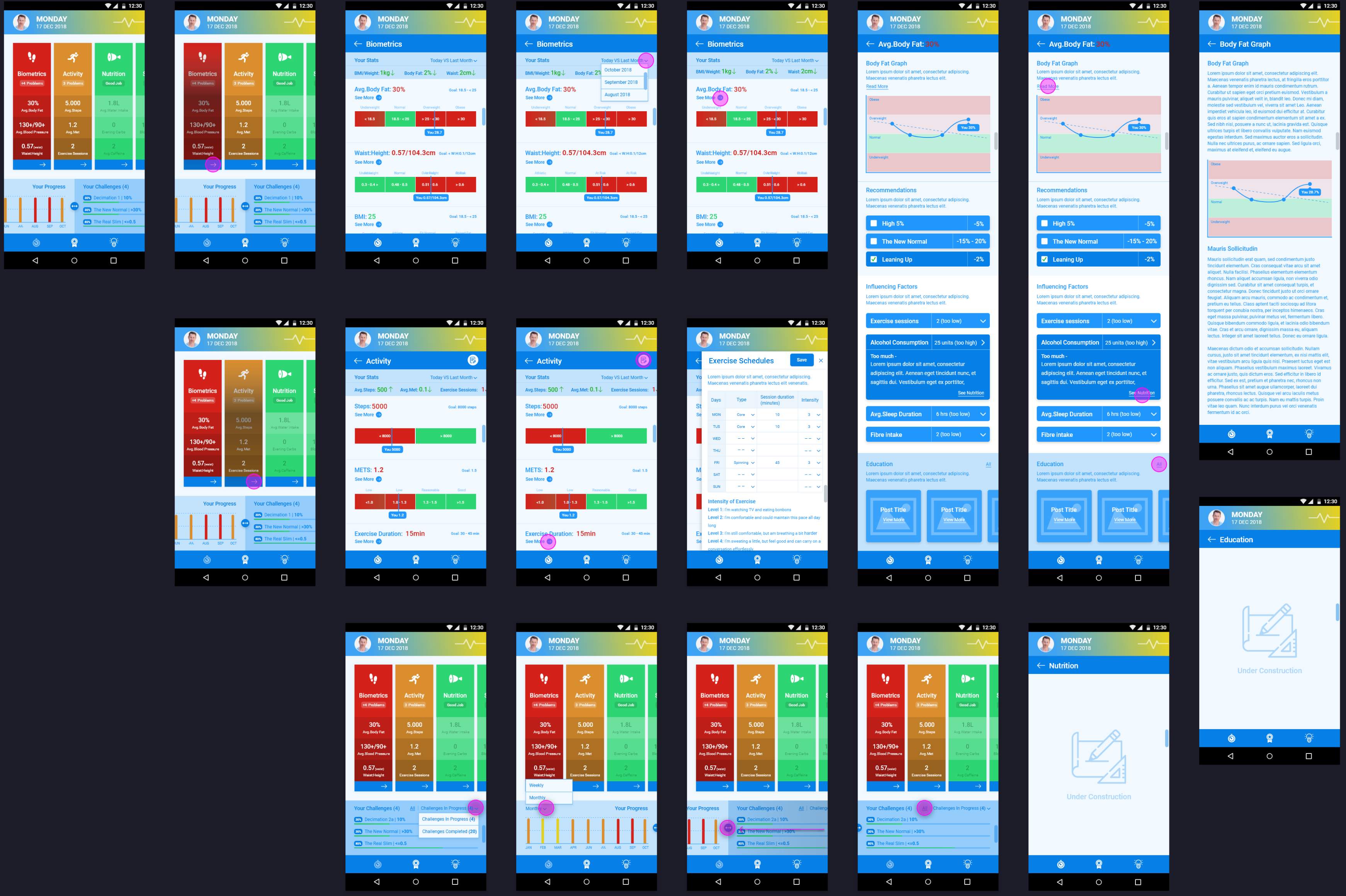
Using the sketches, I started to digitise my designs. I created a series of low-fidelity mock-ups using Adobe XD Design to validate my initial proposal and then, having enough material, show and obtain feedback from my team and later the client.

I decided to only work on low fidelity, since the objective of this project stage was not to show the final product but to present the idea/concept to get approval from the client. From there, we would go on to high fidelity design and development.
My Suggestion

The Client Proposal

I proposed a strong change of the direction of the product. Going from a serious and formal look, with heavy blocks of text and low interaction to an app, with a more modern, colourful appearance, new functionalities and visual interactive elements that would help to encourage the users engage on a daily basis.

Apart from this change of focus. I also wanted to solve the other UX issues by making the navigation more user friendly and intuitive. In addition, I completely refreshed the UI, making it simpler to check what is going with the users’ status a glance. The main key of the proposal revolved around a new notification system, tracking of the users’ physical activity and health. This consisted of communicating the state of the user's health via a visual colour range system. The colour of the users’ status depends on the status of six different areas that CorResilience covers. These bars change colour and position in the UI, depending on whether the user has actions to do. For example, if the Nutrition section was suffering, the Nutrition bar would display in red and would be elevated to higher prominence in the UI.

Final Thoughts

My research skills were well used throughout this project - This in-depth knowledge of my users needs and the choices that had to be made bolstered my proposal and gave me great confidence in presenting the final concepts to our client. The client found the conclusions valid and liked the idea of better security represented in my mock-ups. We obtained the green light to develop the project on the back of this proposal, which I was very proud of.

Let’s do something amazing

Feel free to get in touch with me

Contact Me