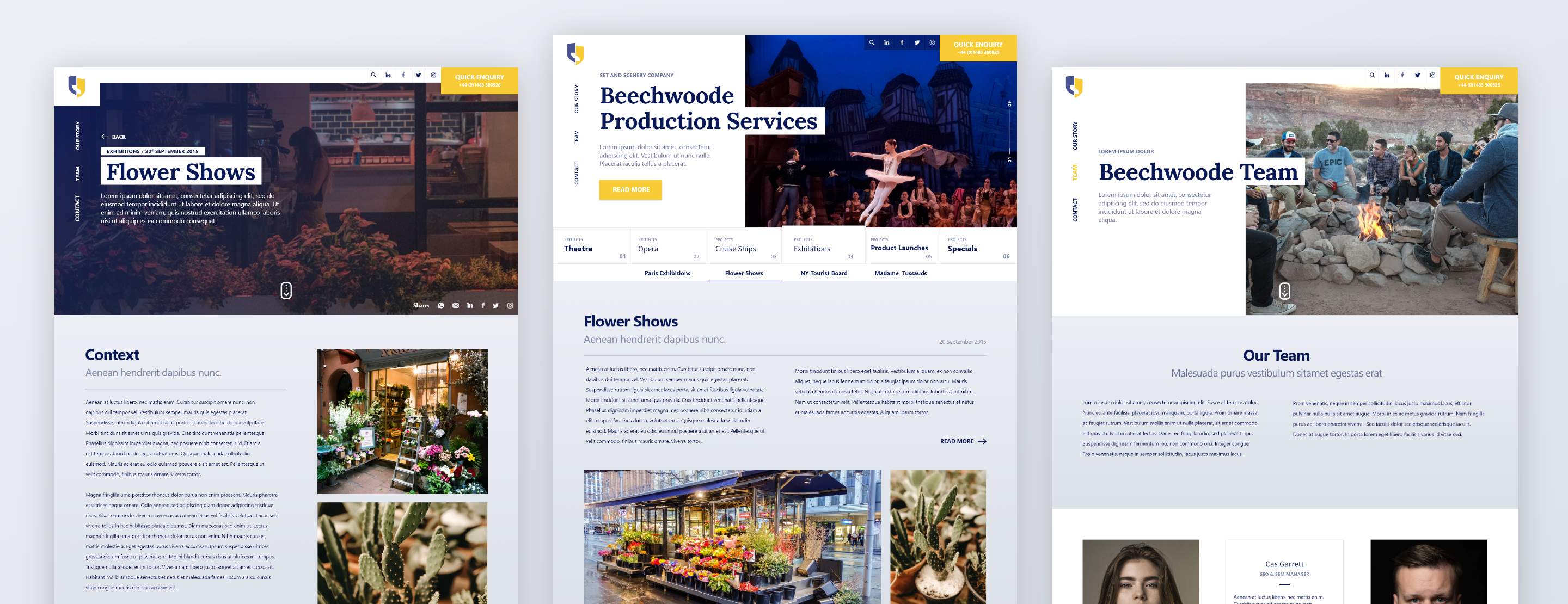
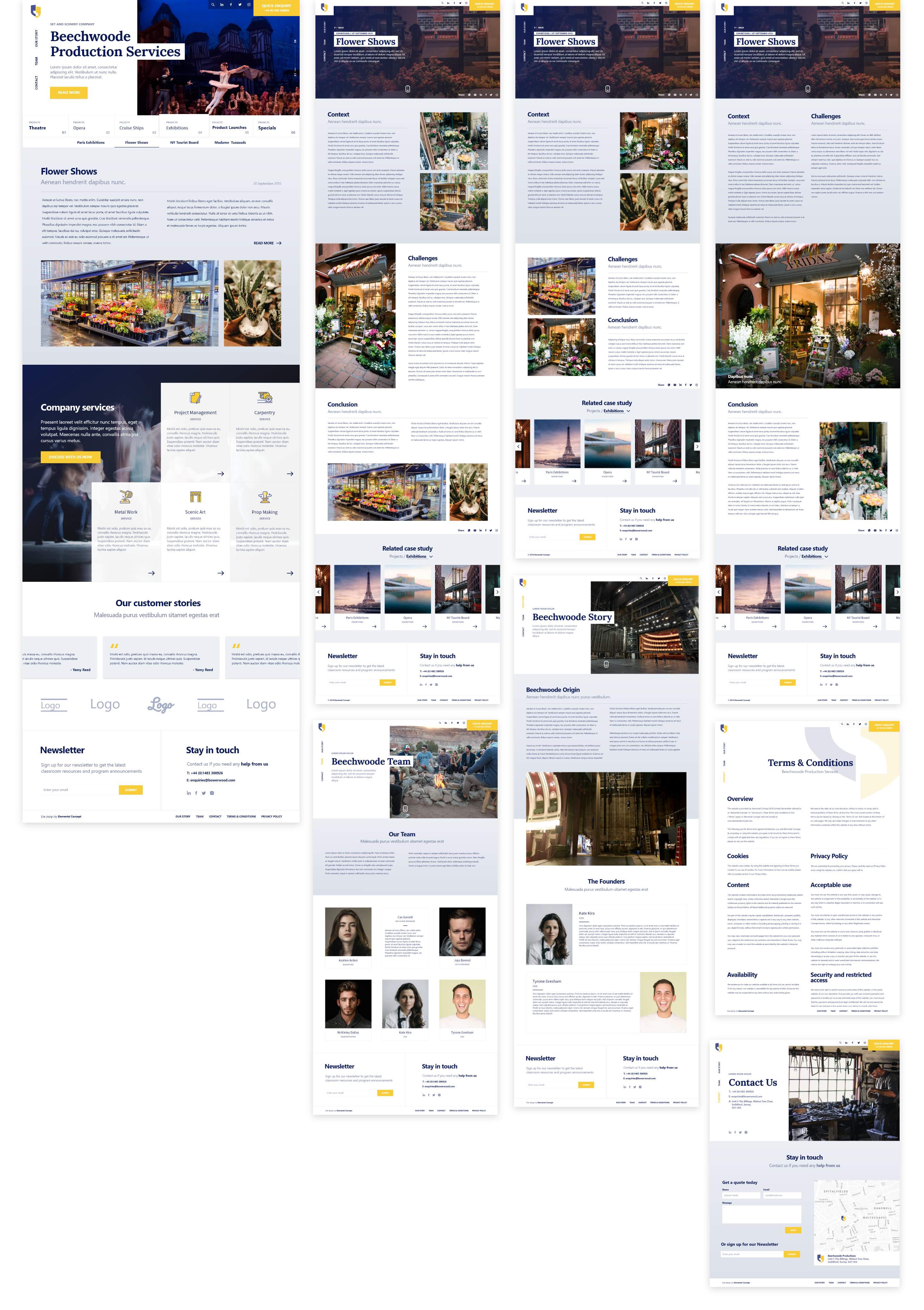
Beechwoode

Quality theatre design and staging company.

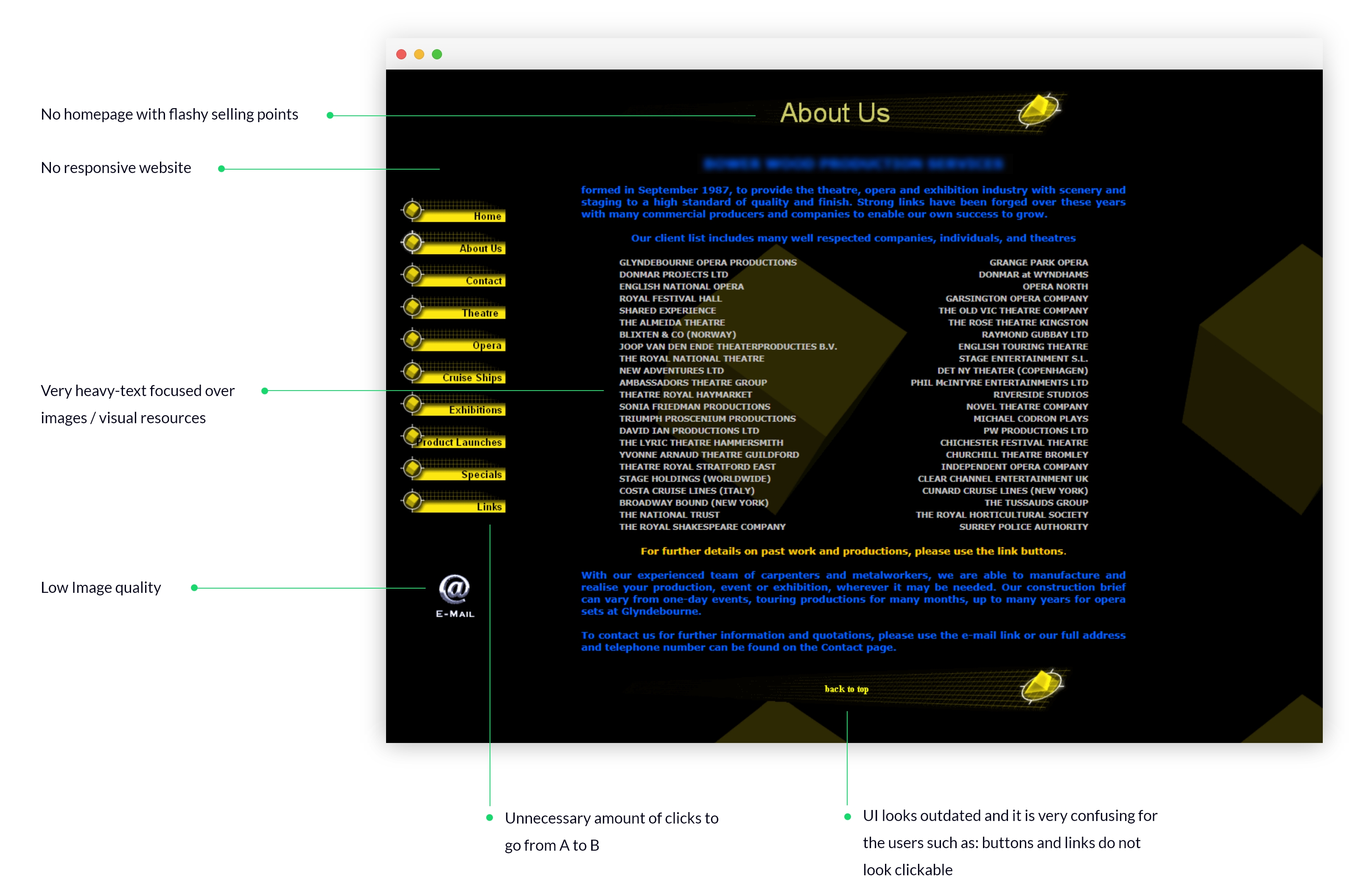
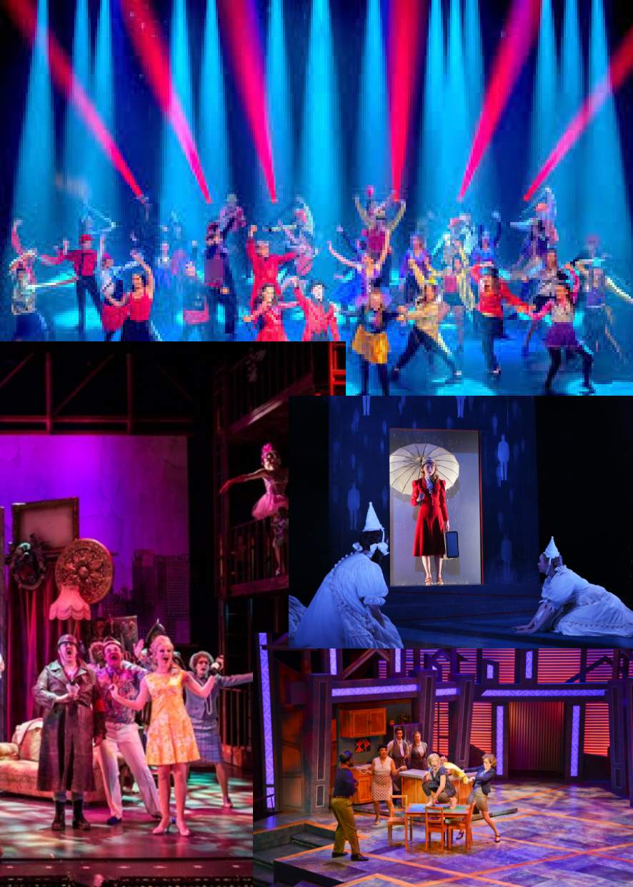
Beechwood is one of the most popular UK B2B companies in its sector due to the quality in its set and exhibition design, construction and production. This company is responsible for the entire manufacturing process and leads the industry with a competent and experienced team of designers, carpenters and metalworkers.

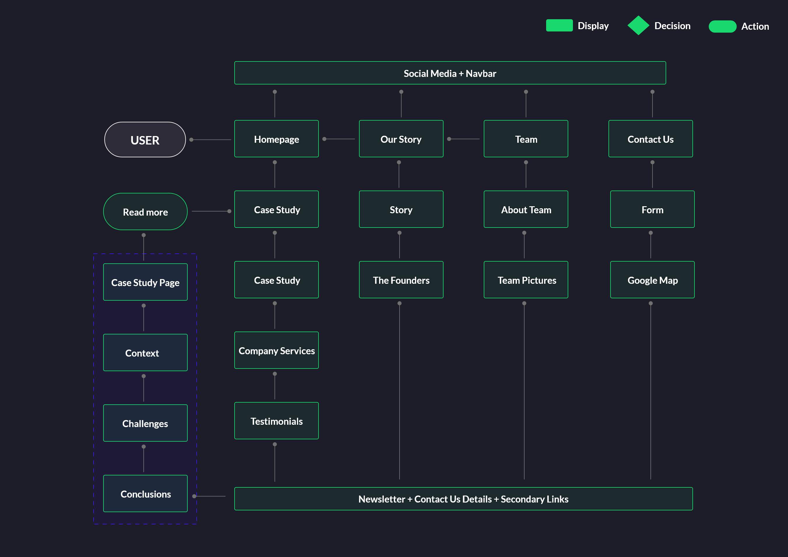
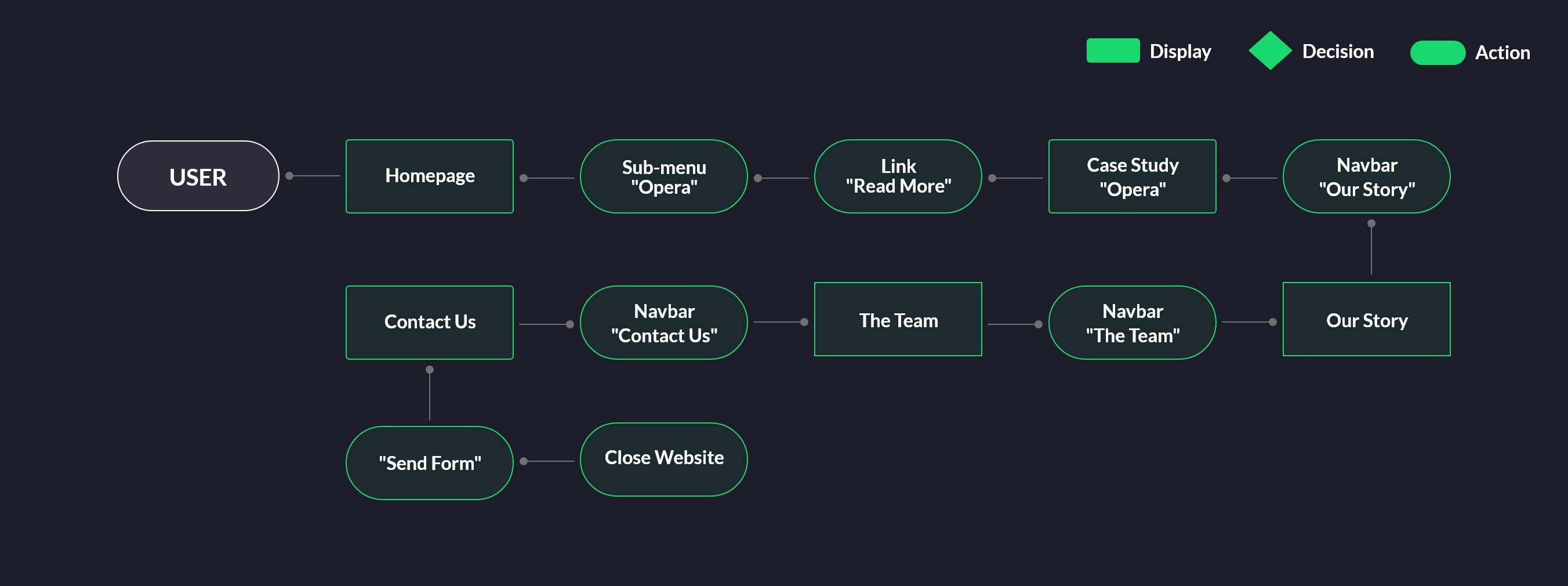
Their website is their main method of contact and tool to capture the attention of potential new customers.

Company

Beechwoode

Project Duration

1 Week

Team Members

Andres Arigon - UX/UI Designer

Problem

Nowadays, a responsive and eye-catching website showcasing your quality of work and the essence of the company can be a huge asset. In a competitive world, you need to stand out from the crowd. In turn, if your site is not up to date, you may find your business missing key opportunities from a SEO perspective, as Google penalises outdated websites, lowering them in rankings or even hiding them from searches.

Beechwoode has been running strong since 1987. Its website however had become somewhat outdated and didn’t represent the recent work of the company or highlights its successes, which may lose Beechwood traffic to more striking websites. A company website could be compared to a first date, where the first impression is the most important and in this case, unfortunately Beechwoode’s had been left behind visually, with great hidden potential. We started this business development (BD) project to help them stand out from the other competing companies by giving them a revamped brand and a new and modern website.

Goals

Project Target

  • Reach new customers
  • Modernize
  • Improve SEO Ranking

Design Target

  • Completely new re-branding
  • Show company potential
  • Responsive website
  • Reduce their bounce ratios
  • Improve user experience

Challenge

As a BD project, the main objective for us was to be able to present different websites and re-branding ideas. We had to present a selection of options to the client to gauge his tastes in order to start developing the project properly.

Therefore, the challenge in this project as a UX/UI designer was not to get lost in the small details and try to meet all the expectations of the client. Having not been involved in the initial chats with the client, I only had two resources to use to have my job ready in a week: Post-it notes taken from their first meetings by the UX/UI Director and by the new information architecture previously approved by the client.

My Process

I started by doing an in-depth UX Audit of the current site, writing down my first conclusions and experience of the pain points in the first person and get a gauge of the general user experience in the current website. This helped in developing my first ideas about the project. I then created a persona to be able to examine my new proposal from a more critical point of view. I performed a quick competitive analysis of the competencies to observe where BeechWoode was in relation to the market and to observe the trends in this sector. Taking all of this into account, I finally got down to work and I created the BeechWoode options.

Personas

Following the profile and needs of current BeechWoode customers. I quickly created a person to help generate ideas for the best solution, without neglecting what the real end users wanted from the new site.

Dion Alston, 45 years old, Kent
Dad, 3 kids

  • Wants to find a company that will design and produce sets for small shows across the UK
  • Final finish is crucial.
  • No time to digest the full website in detail - He wants something easy to understand and scannable.
  • He prefers to find visual elements and photos of previous work related by the company followed by opinions.
  • Always ask for references.
  • Doesn’t have a big budget.

Competitive Analysis

I wanted to observe what were the UI trends in the sector and examine the information architecture of these sites, how they show their services, case studies, etc.

Scenetec

  • Clean UI and very white site.
  • Stunning project pictures over heavy text block.
  • Small text details. It looks more like a personal blog than a company B2B website.

3DCreation

  • Very visual and colourful site over heavy text.
  • Very focused on case study.
  • Clear CTA to contact them.

Scecnic

  • Modern and responsive UI design.
  • Focus on visual and case study.
  • CTA everywhere “Enquire now”, it is sometimes a little annoying.

UX Audit

BeechWoode, having been in the market for years, has a wealth of experience to stand out from the competition, as well as a variety of striking case studies, client testimonials and an experienced team with years of experience behind them. The old website was lacking visually for a company with such a successful history.

Below are the key points of my UX Audit report which have been of great value for the subsequent design, highlighting the possible user frustrations.

Visual Research

As always before I start thinking about new UI, I search for a bit of visual inspiration research which I gathered in a mood board.

Mood Board: Stages

A theatre compiled from different scenarios to better understand the product.

Mood Board: Case studies

As I think that the main channel this company offers their services is through flashy case studies it was interesting to research.

Mood Board: Theatre & cinema sites

Another good visual research to understand the market better.

Information Archicture

Having not met the client, I found this information architecture made by Roisin O’Toole (UX/UI Director) a key tool in developing the site concepts. It was useful to understand the size of the project, what the customer expected and an excellent guideline to understand all possible user flows and pain points..

User Flows

I created this UX map to better understand the operation of the website and how to optimise the user experience and conversion on the site.

User Flow: General flow

General user flow with all the possible/relevant paths that users can take through the site.

User Flow: Specific flow

As a user, I would like to go to case study Opera then go to about the company then go to about the team and finally send an enquiry "

User Flows: Pen and paper versions

Previous user flow before being digitised.

Sketches

Some of my quick sketches with several ideas that were part of my private UI brainstorming which helped me to define the style and directions of my proposal..

High Fidelity Mock-ups

Below you’ll find all of the page designs that were shown to the client. A complete revamp of the company's look including its new branding.

Guideline

A key part of the re-brand was to establish a whole new and fresh online identity for the company, starting with designing a logo, which until now it did not have. I wanted to create a logo that clearly reflects the essence of the company.

Colour Palette

Main palette used throughout the app.

Logos

Some of the logos that I showed up to the client as a proposal for re-branding.

Typography

The typography used.

Final Thoughts

Though limited in scope, this project had its challenges. With little contact with the client, it was difficult for me to have a clear idea. With my team behind me giving me support and new ideas, I was able to establish a strong design and online identity that really resonated with the client.

Let’s do something amazing

Feel free to get in touch with me

Contact Me