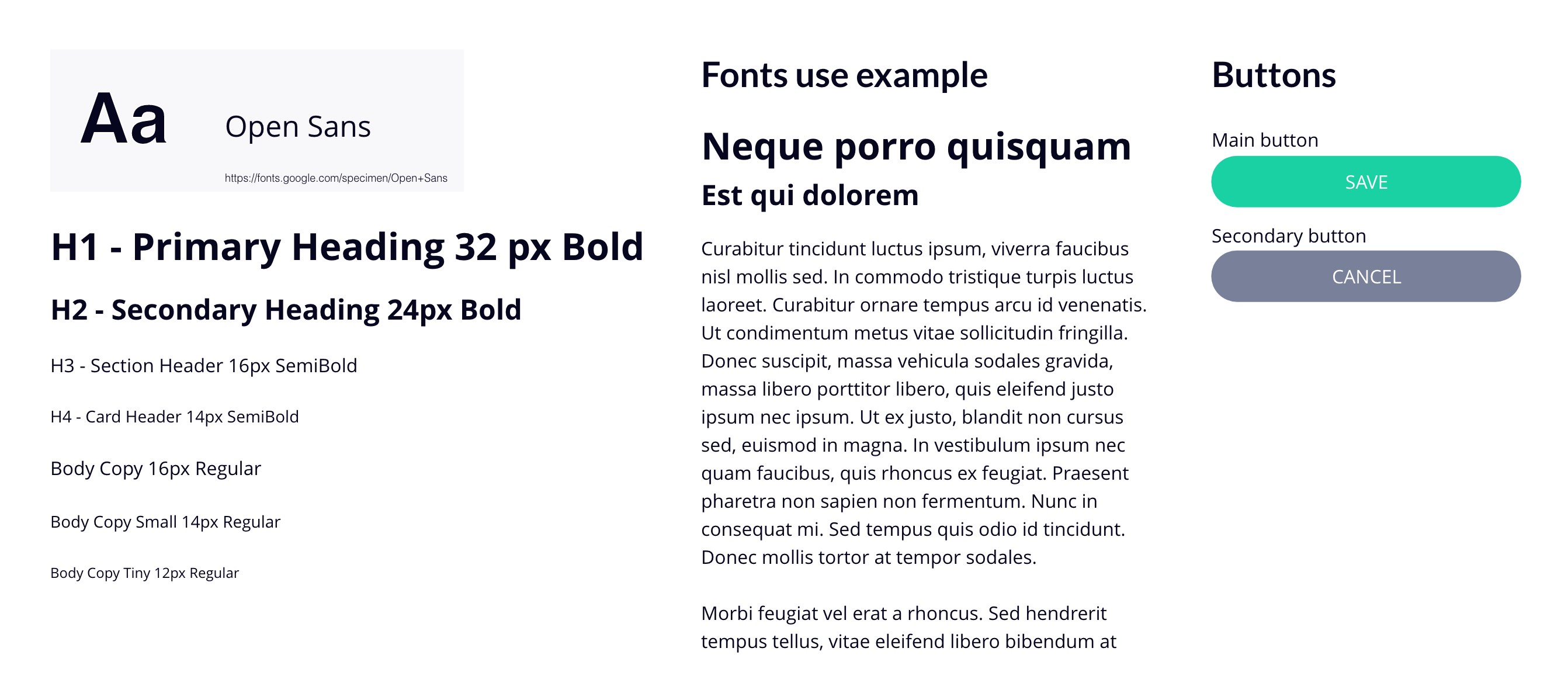
Personas
In order to better understand this project I have created these two
personas Alice and Tom who followed me throughout the whole project, helping me to make informed
decisions and to better understand this project from their point of view and to create the best user
experience possible for the potential customer.
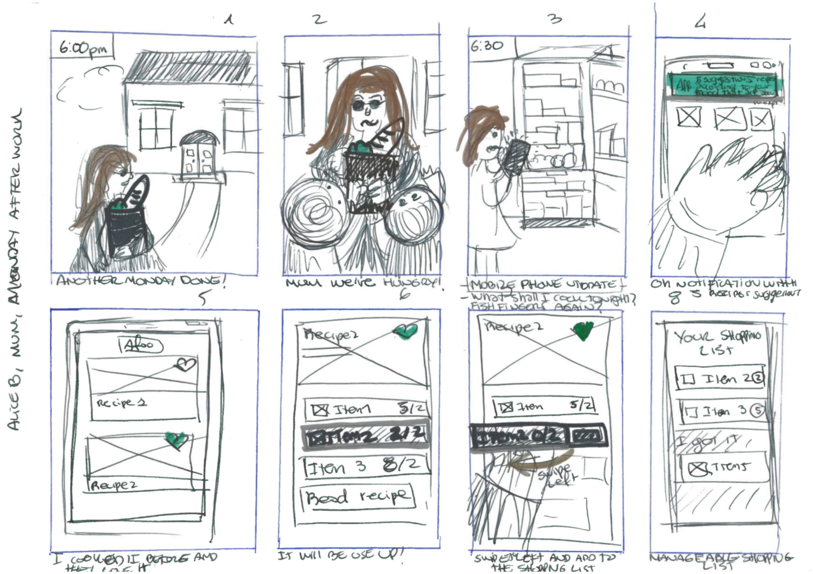
Alice Bray, 35 years old, London
single mum, 2 kids
- Works all day and doesn’t have a lot of time to cook anything.
- Mostly she prepares pre-made food however, she wants to make changes in her families life
habits.
- Small supermarket shopping every weekend.
- She knows she has food in the freezer but she doesn’t know what she has.
- She throws 30% of purchased food into the bin.
- Low food management control.
- 1 kid has lactose intolerance.

Tom Cooper, 20 years old, London
Student, shares flat with 5 students
- Low cooking skills.
- Pre-made and take away food.
- Shared fridge, he has a shelf.
- A lot of expired food inside the fridge.
- They throw 60% of purchased food away.
- Low food best-day-to-use management.
- Sometimes he makes food for himself and another housemate.
- He goes to the supermarket when he sees his shelf is empty.
Point of view
To enable my design process and brainstorm possible ways of creating the app, I decided to use quick UX methodology to better understand the possible user’s needs and goals, what they want to achieve by using this app and define the problem statement, which allowed me to ideate in a goal-oriented manner.
~ Alice Bray
“I’d love to have recipe suggestions (lactose free) every day before dinner time to
prepare a fresh meal using the items in my fridge which are about to spoil because I don’t have the time
or imagination to think what to cook when I get home after a long day of work and I always finish
cooking something from the freezer, not fresh”
~ Tom Cooper
" I’d like to see all the food which my flatmates allow me to use because sometimes I
would like to cook
something quick but I don’t have one of the items, they may have it their fridge and I am not sure if I
am
allowed to use it or not because we have different schedules"
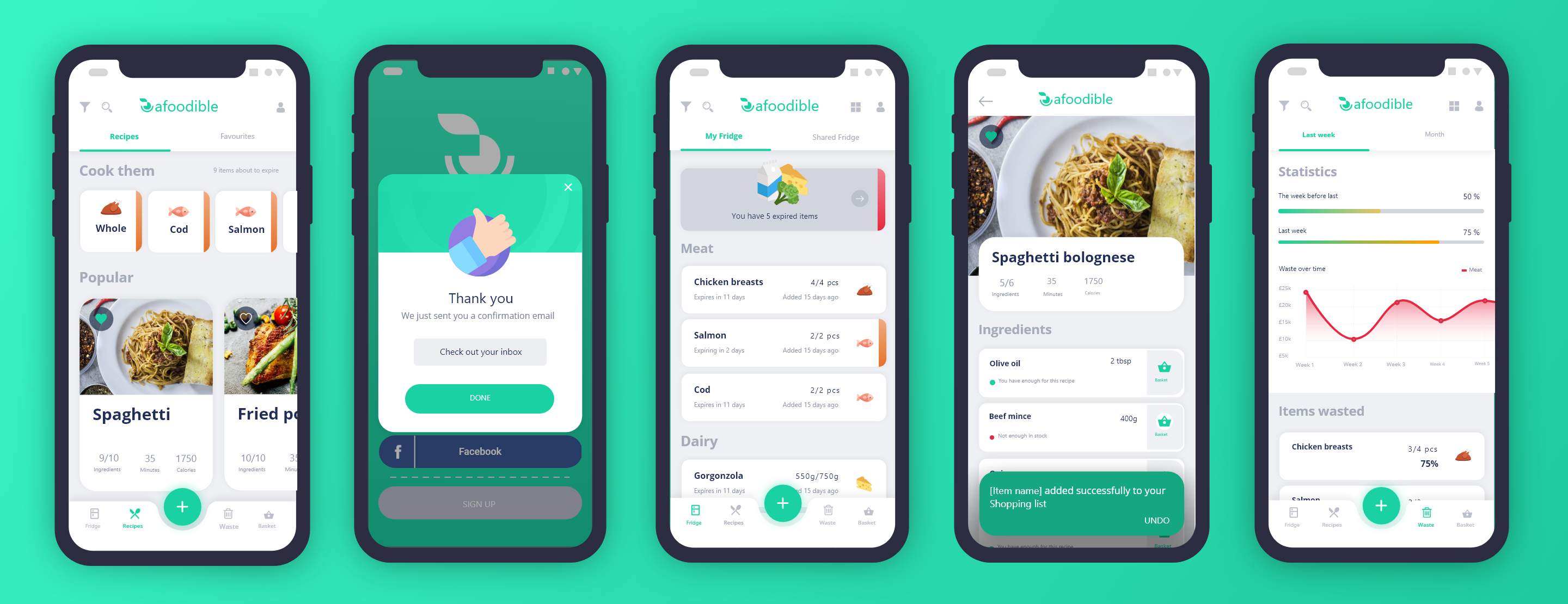
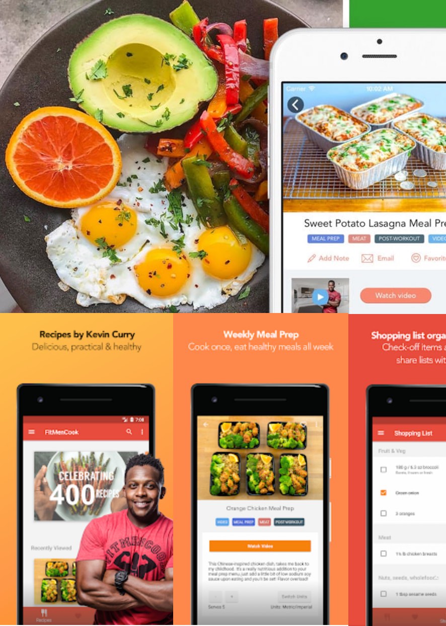
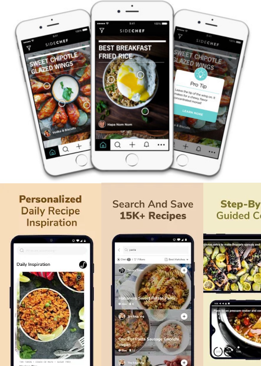
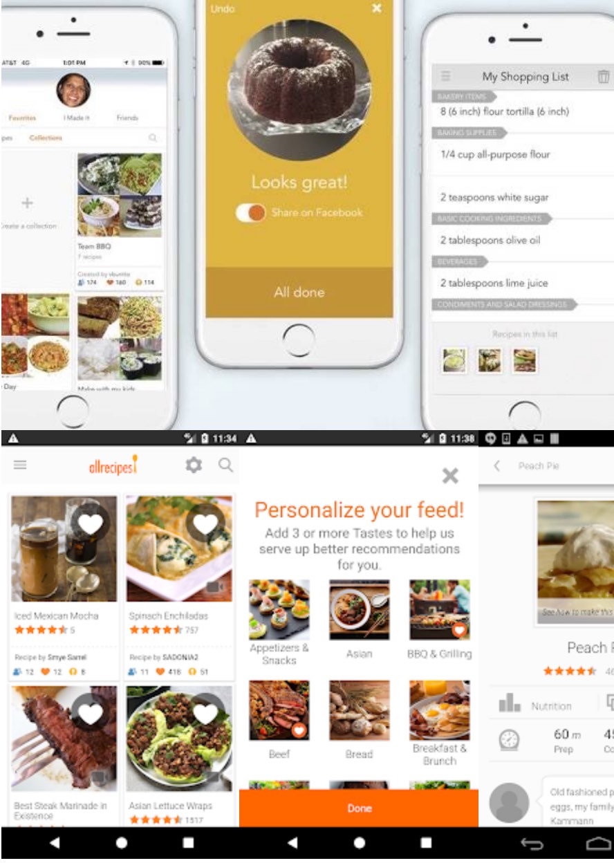
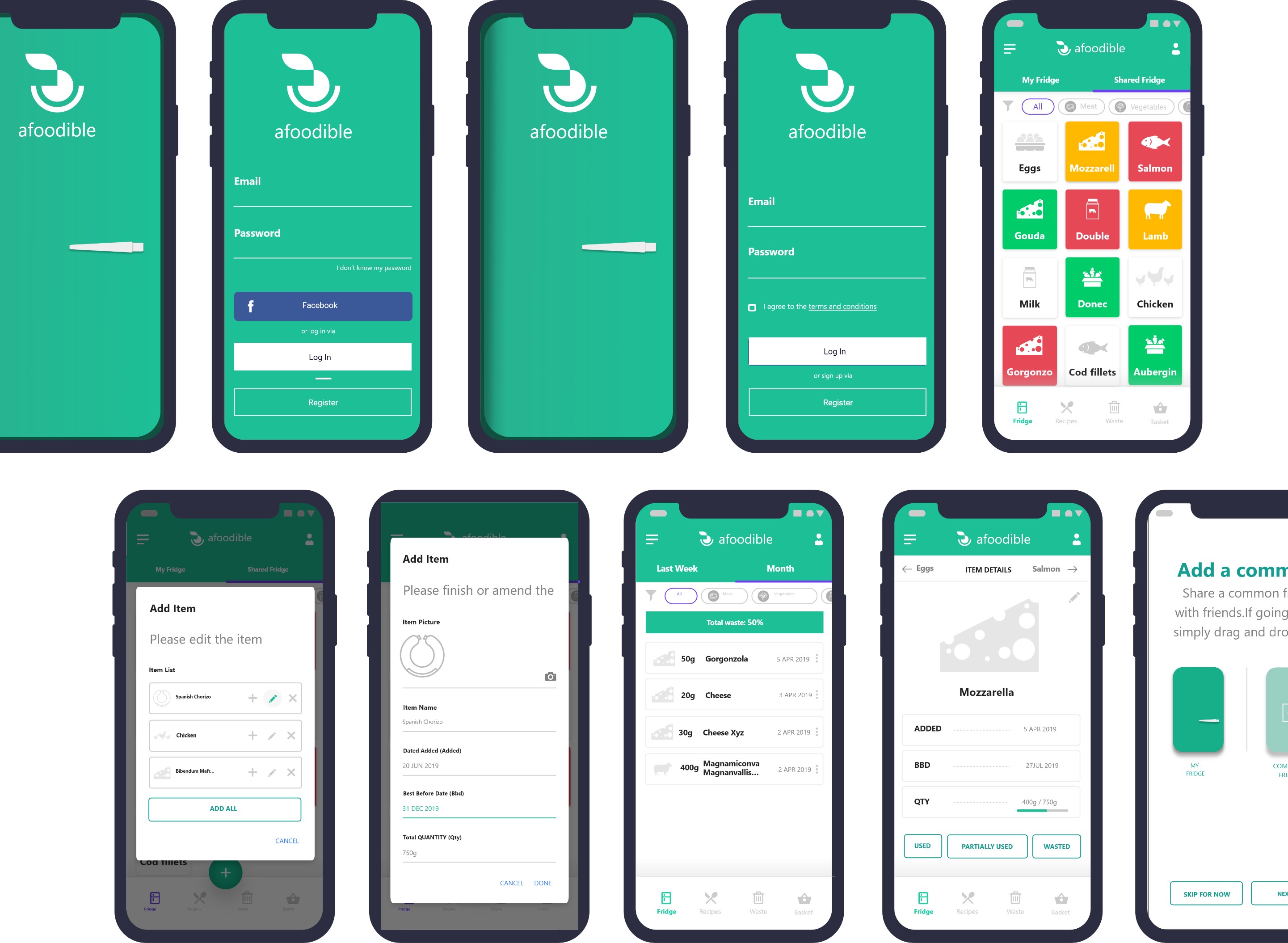
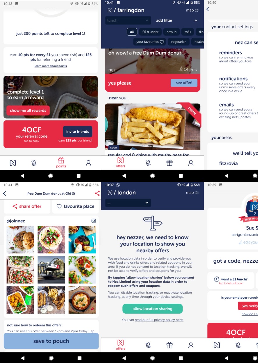
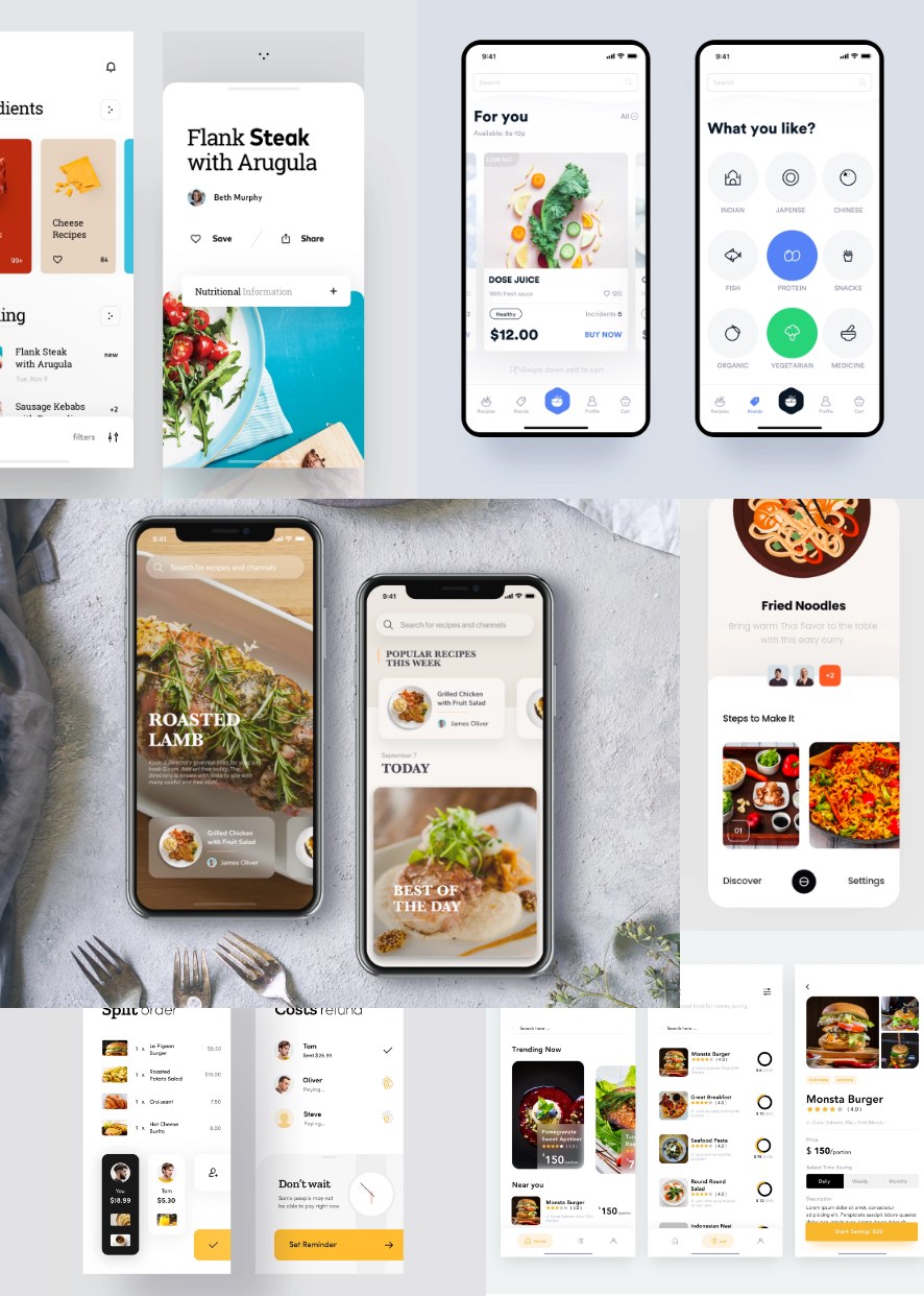
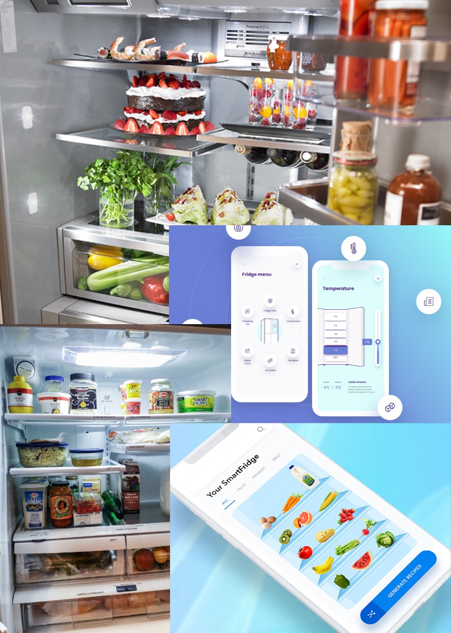
Competitive Analysis
Before thinking in depth about the design, but with an idea in my head of possible approaches, I researched similar apps and feedback on them to see what they offer and how they presented it. This helped me to define my user flows and avoid current pain points from other offerings.